
Intro to Hand Analysis
Note: Links to resources used in this course, as well as associated instructions, may be found under the “Materials” tab on the homepage for this course, located here, as well as under the “Materials” tab for this lesson, Intro to Hand Analysis (the materials on the main course page as well as this lesson page are identical). We recommend using the links and instructions found on these pages to follow along while taking this course!
A computer model may objectively analyze weather data in a way which makes it easier to understand. However, doing this analysis by hand can often provide more insights as to how and why weather will evolve. On days with greater risks for severe weather, it is common for forecasters to create their own hand analysis, especially of surface observations, in order to better understand the placement of fronts, moisture, low pressure systems, and winds. This understanding can be pivotal to determining when and how severe thunderstorms will form, including which hazards are most likely to occur and what the convective mode will be.
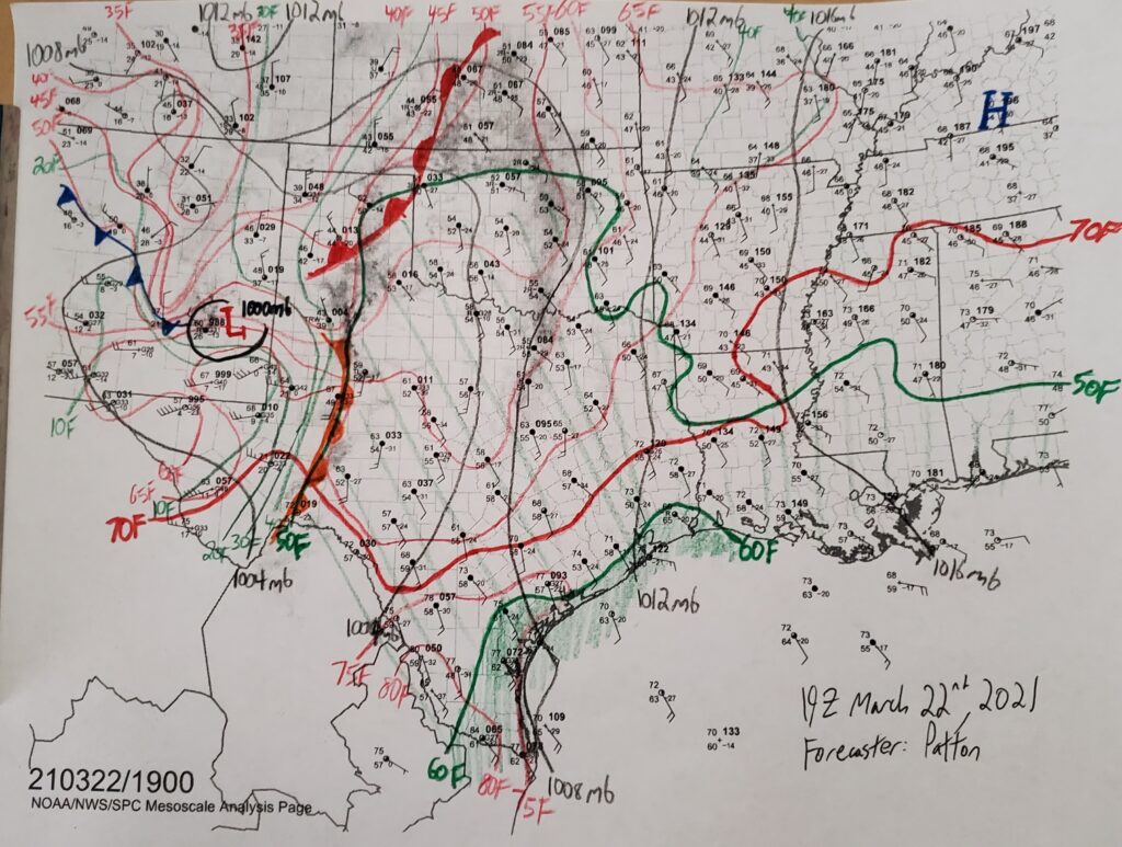
The above example is a subjective hand analysis from a severe weather outbreak on March 22nd, 2021. This event resulted in at least two tornadoes, as well as multiple reports of hail at least three inches in diameter and wind gusts over 70 miles per hour.
The green shading on the surface analysis represents the higher moisture values at the surface, which is a necessary ingredient for severe thunderstorms. The solid red lines represent temperature contours, while the solid black lines represent pressure contours. The pressure that is plotted on surface maps is the mean sea level pressure (MSLP), and it represents the pressure the station would have if it were at sea level, rather than being above sea level. The pressure is converted to MSLP because it would be impossible to compare surface pressures from low level weather stations and elevated weather stations, as these elevated weather stations would have lower pressures because they are higher up in the atmosphere. Typically, but not always, a local low pressure system is responsible for the placement of fronts at the surface, meaning that most fronts stem from the center of the low pressure.
Placement of the Fronts
The position of fronts depends on the changing air mass the front is representing, and the change in winds along that boundary. In general, cold and warm fronts are placed just ahead of the tightening temperature gradient (where the red temperature lines become close together) and where there is a significant difference in the surface winds between the two sides of the front. In the above example, the warm front is drawn from the Texas panhandle into northwest Oklahoma and south central Kansas. Along this line, a noticeable change in wind direction is present, where winds to the west of the warm front are generally from the north and winds to the east of the warm front are generally from the southeast. In this example, a clear dry line is also present, representing the boundary between a very dry air mass in far western Texas and a much more moist air mass in central and eastern Texas being fed moisture by the Gulf of Mexico. In addition to the strong dew point temperature gradient (shown by the green lines which are close together), there is a significant change in wind direction and speed along the dry line. For most surface fronts, the most significant feature will be the change in winds, as converging surface winds often indicate a lifting mechanism for thunderstorms.
The icons along the edge of a front are always drawn in the direction the front is moving. For example, the dry line in the above image drawn in western Texas has orange semicircles drawn on the eastern side as the dry line was advancing to the east on this day. The direction of the movement of the front can often be determined by looking at the direction of the winds in the gradient of either temperature or dew point temperature.
Link to upper-air maps: https://spc.noaa.gov/obswx/maps/
Link to observed soundings: https://www.spc.noaa.gov/exper/soundings/
Link to mesoanalysis: https://www.spc.noaa.gov/exper/mesoanalysis/
To get archived unanalyzed mesoanalysis maps, click on one of the regions in the link above. Then click on image archive and loops. On the following page, hover over loop options and you should be able to select hourly mesoanalysis from up to several months in the past. This will load a loop in GIF format; to get one particular image, right-click and open the image in a new tab to download and print it. To get current printable surface maps, select a region, hover over the observations map, and select "Printable Surface Maps [PDF]". This will bring up the most recent hourly surface observations from that region.