
Surface – Temperature
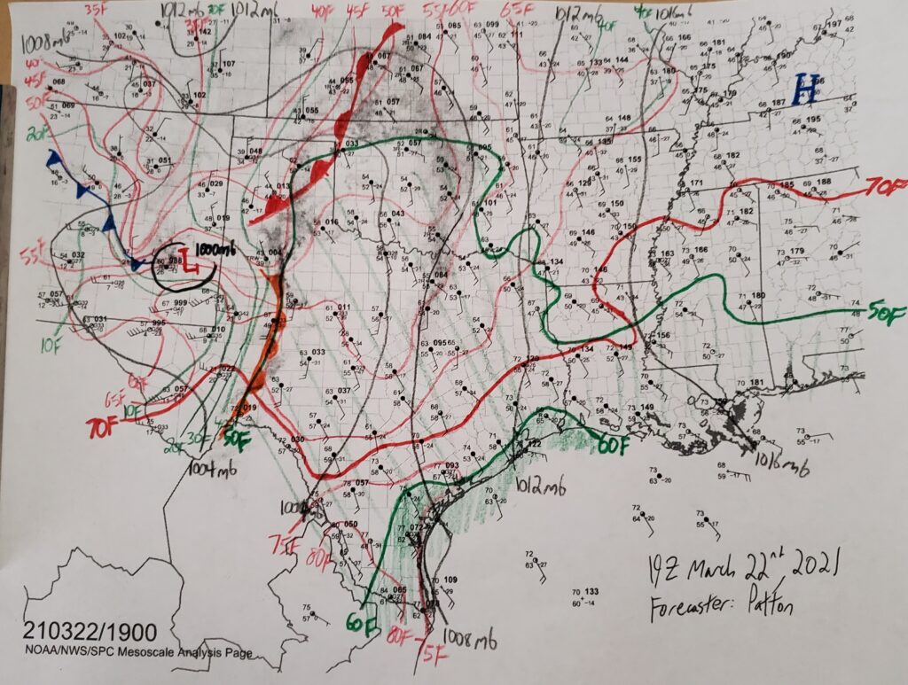
Lines of constant temperature are drawn on surface analyses with solid red lines every five degrees Fahrenheit for numbers which are divisible by five. The above surface analysis has temperature contours drawn at 60F, 65F, 70F, etc. Similar to pressure, a good rule of thumb for starting to draw temperature contours is to find the smallest or greatest surface temperature and begin contouring values which are greater than or less than that temperature, respectively. For example, the highest surface temperature in the above surface analysis appears to be 84 degrees Fahrenheit, near the southern tip of Texas. The first temperature contour one might draw on this map would then be the 80F contour separating the measured temperatures above 80 degrees Fahrenheit from those less than 80 degrees Fahrenheit. The actual placement of that line can be an estimation of the change in temperature between nearby stations, such that the values which are closer to the value of the temperature contour are closer to the value itself. For example, a temperature contour dividing two stations, one with a temperature of 81F and one with a temperature of 77F, would be closer to the station with a temperature of 81F. This method of drawing contours applies to all variables on all hand analysis maps.
Determining the Surface Temperature from the Station Plot
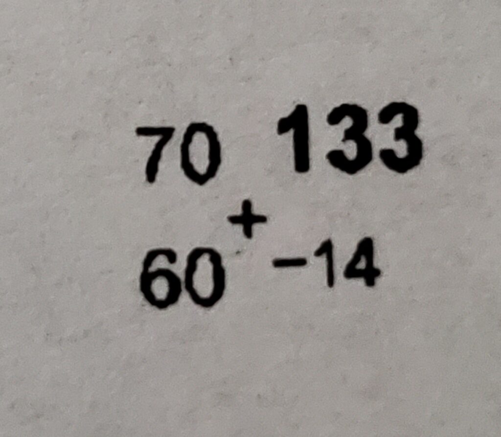
The surface temperature will always be written in the top left corner of the station plot. From the station plot in the above example, the recorded surface temperature is 70 degrees Fahrenheit (70F).