
How to Interpret Soundings
Soundings are plots of the data retrieved from weather balloons and they can be pivotal in understanding the characteristics of the atmosphere for forecasting. They are one of the few ways in which the atmosphere is directly measured by instruments at higher altitudes. Below is an example sounding from Norman, Oklahoma just before an infamous severe weather outbreak. This lesson will explore how to interpret some of the features of soundings such as this one.
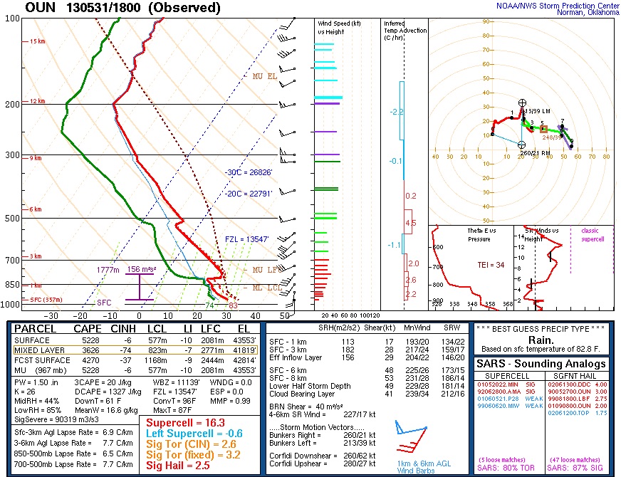
Understanding The Temperature Graph (Top Left)
All of the data which is actually measured is in the graph in the top left portion of the above image. On this graph, the solid red line is the measured air temperature, and the solid green line is the measured dew point temperature. The black wind barbs along the right side of this graph represent the measured wind speeds at that level, which are derived from the GPS location of the weather balloon at that pressure level. The numbers along the bottom of the graph in black (-30, -20, -10, etc) are the values of temperature in degrees Celsius. The gray dashed lines represent lines of constant temperature and are labelled according to those values of temperature along the bottom of the graph. The temperature lines for 0 and -20 degrees Celsius are highlighted in blue, and the pressure level where the solid red temperature line crosses the tilted blue dashed line along 0 degrees Celsius is the freezing level in the atmosphere. This graph is often referred to as a “Skew-T” since temperature is a skewed axis opposed to just being straight from left to right. Finally, for example, at the 500 millibar pressure level the environmental temperature (solid red line) is about -8 degrees Celsius, the environmental dew point temperature (solid green line) is about -23 degrees Celsius, and the winds are 50 knots from the west-southwest.
The solid yellow lines curving from the bottom right side to the top left side of the graph are called dry adiabats, and these are lines which the environmental temperature would follow if the atmosphere were completely dry. The change in temperature with height is known as the lapse rate, and the lapse rate of perfectly dry air is known as the dry adiabatic lapse rate, which is about 9.8 degrees Celsius per kilometer. In other words, the temperature of dry air would tend to decrease about 10 degrees Celsius for every 1 kilometer of height added in the atmosphere. In this example, the red line representing the environmental temperature is not as steep as the solid yellow lines, meaning that the air temperature is not decreasing as quickly, probably due to the moisture content in the air.
The dashed red line on the right side of the graph represents the theoretical temperature of an air parcel if it were forced upwards to create the initial updraft of a thunderstorm. If the air parcel temperature is warmer than the environmental air temperature, then the air parcel would be buoyant and want to continue rising. Likewise, if the air parcel temperature is cooler than the environmental air temperature, the air parcel would tend to sink unless forced upwards by something like a cold front or surface convergence. The labels on the far right side of the graph of LCL and LFC represent the levels at which lifted air parcels would begin condensing into clouds, and would begin rising freely as they are warmer than the temperature of their environment, respectively. In other words, a feature such as a front pushes an air parcel upward, creating clouds first at the level marked by the LCL, and then by the time the parcel reaches the LFC, it will want to rise on its own without being forced upward by the front. The parcel will continue to accelerate upwards until its temperature is finally cooler than the environmental temperature. This level where the air parcel temperature and environmental temperature are equal again is called the equilibrium level (marked as EL). On this sounding, the equilibrium level is located at about 160 millibars or about 13 kilometers.
The positive buoyancy between the dashed red line of the air parcel and the solid red line of the environmental temperature is referred to as CAPE, or Convective Available Potential Energy. It is a measure of the instability in the atmosphere, and it is based on how much warmer the air parcel would be than its environment in perfect conditions. In this image, CAPE values are listed in the left-center panel, with a surface-based CAPE value of 5,228 J/kg. This means that for every one lifted kilogram of air, 5,228 Joules of energy could be released. For reference, a watt is one Joule per one second, so a 60-watt lightbulb would use 60 Joules of energy per second. The amount of negative buoyancy, where the air parcel is cooler than the environment, is also calculated based on this sounding. It is listed as the values under CINH, which stands for convective inhibition. This represents how much energy it would take to get the thunderstorms going before an air parcel reaches the LFC. In this sounding, an air parcel starting at the surface would experience CINH of about 6 J/kg.
The wind barbs are plotted on the far right-hand side of the Skew-T. Each short dash represents 5 knots, each long dash represents 10 knots, and each triangle represents 50 knots. For example, at the 300 millibar level, there is a west wind (wind coming from the west) at 55 knots, or about 63 miles per hour. Typically, a favorable wind profile with height is one that turns clockwise as altitude increases. In this sounding, we see winds turn clockwise from south to southwest to west with height, which would generally be favorable for severe weather. The winds are not measured directly, but calculated based on the changing GPS coordinates of the weather balloon, which is being tracked as it is in the air.
Numerical Values in Lower Left-Hand Corner
The chart of numerical values listed in the lower left-hand corner are all calculated based on the temperature and dew point plot above. Each row in the top part of this chart is a different estimate of how air parcels could behave within thunderstorms. The surface row indicates the values associated with a surface-based parcel, whereas the “MU” or “Most Unstable” row represents the values which maximize the instability of rising air parcels. In this case, the most unstable parcel would be lifted starting at a level of 967 millibars, which matches the profile of surface-based parcels.
The middle section of values represents some other thermodynamic qualities of the above sounding. These won’t be explored in-depth in this course; however, a couple values of note include PW (or precipitable water) and DCAPE (downward CAPE). Precipitable water indicates how moist the vertical profile of the atmosphere is and may be a key quantity for predicting flash flooding events. Precipitable water values associated with flash flooding differ for each station. For example, what may cause flooding in Las Vegas, NV is different than Miami, FL. Downward CAPE represents how much energy may be available for events where air is rushing downward toward the surface due to evaporative cooling and falling rain. High downward CAPE values may be associated with a risk for downbursts, which could cause severe wind gusts at the surface as air rushes towards the ground and then spreads out in all directions.
In the lower left corner of this chart are the different lapse rates based on the temperature profile. These values indicate how quickly temperature is decreasing with height in different layers. In this sounding, the surface to three kilometer above ground level lapse rate is 6.9 degrees Celsius per kilometer, and the 3-6 kilometer lapse rate is 7.7 degrees Celsius per kilometer. Generally, the higher the lapse rate, the more CAPE could be generated and the more instability there could be. Typically, severe weather events have lapse rates at least 6 degrees Celsius per kilometer, with values closer to 7 or 8 degrees Celsius per kilometer more often associated with the strongest severe weather events. The values in the lower right box indicate some parameters, which may show how likely severe weather is with this sounding. For example, the supercell parameter in the first row indicates how likely supercells are to form based on this sounding, which is important because supercells are very likely to produce severe weather. The median surface-based supercell parameter value on days when supercells form is 5.7. In this sounding, the supercell parameter value is 16.3, which is more than enough for supercells to be expected to form in this environment.
Numerical Values in the Bottom-Center Box
The bottom-center box lists values related to the wind profile and how that would support and advect different types of thunderstorms. Not all the values will be explored in-depth in this course; however, some of the most important ones for understanding severe weather potential are discussed in this section.
The top rows list different wind values for different layers in the low levels of the atmosphere. The first column listed is SRH, or Storm Relative Helicity. SRH is a value that represents how much spin there is in the atmosphere based on the vertical wind profile. Higher SRH values (greater than 100 m^2/s^2) may be more supportive for the formation of tornadoes. This sounding has SRH of 113 m^2/s^2 in the lowest kilometer above the surface, which would generally be supportive of tornadoes. The second column listed is shear in knots, which is simply how much the magnitude of the wind changes between the bottom of the layer and the top of the layer. The third column listed is MnWind, or mean wind, which gives the average direction and speed of the wind in knots in that layer.
The bottom half of this box gives estimates for the direction and speed of certain types of storms if they were to form in this environment. For instance, a supercell which forms and then moves towards the right would follow the Bunkers Right storm motion vector, which is 21 knots at 260 degrees in this sounding. So a right-moving supercell in this environment is expected to travel at about a speed of 21 knots moving from the west-southwest to the east-northeast.
Hodograph (Top Right of the Sounding)
The last aspect of soundings which are discussed in this course are hodographs, which are often displayed in the top-right portion of the sounding. The hodograph plots how winds are changing in speed and direction with height. The axes represent the east-west and north-south winds in each direction. Each point plotted on this hodograph (represented by a black dot) is the wind speed and direction associated with each kilometer of height. There’s a point plotted at each kilometer (0, 1, 2, 3, etc) and each individual wind barb from the Skew-T affects how this plot is generated between each kilometer as well.
Each wind reading is plotted on this hodograph and the x, y coordinates are the components of that wind in the east-west, north-south directions. For example, the wind at the surface in the Skew-T is from due south to due north at 10 knots. On our hodograph, the black dot for zero kilometers (or the surface) is right at 10 knots in the north direction. All of the other wind readings are plotted on the hodograph in the same way, and the line connects all of the readings with height. So a hodograph that travels from left to right with height represents a clockwise turning or veering wind profile, which is usually associated with severe weather. In this sounding, winds are generally turning clockwise with height, as would be expected for a severe weather environment.